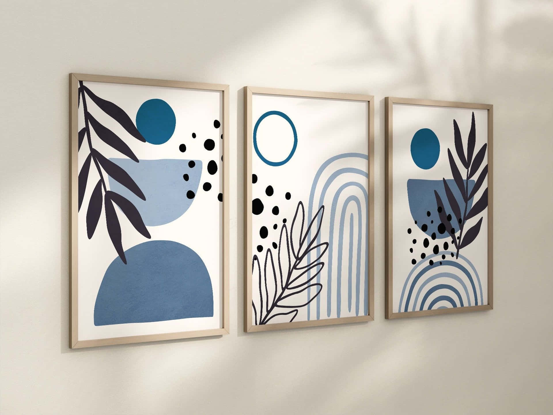
In a world where we are constantly bombarded with stimuli, the concept of minimalism in design has emerged as a refreshing perspective. Minimalism is more than just a design trend; it’s a philosophy rooted in simplicity and functionality. The idea that “less is more” has profound implications in various fields, from graphic and industrial design to architecture and interior decorating. In this blog, we will explore the principles of minimalist design, its benefits, and practical tips to implement minimalism in your own projects.
Understanding Minimalism in Design
Minimalism emphasizes simplicity and the elimination of excess. In design, this translates to clean lines, restricted color palettes, and a focus on essential elements. The objective is to create a space or a product that promotes clarity, increases usability, and evokes emotion without overwhelming the user.
Key Principles of Minimalist Design
- Clarity and Functionality: Every design element should serve a purpose. Clutter and unnecessary ornamentation can distract from the overall message or function. By keeping only what is essential, we allow users to engage with the design more effectively.
- Balanced Composition: Minimalism thrives on balance and harmony. Whether it’s a website layout or an interior space, achieving a sense of equilibrium can make the design visually appealing while enhancing usability.
- Negative Space: Often referred to as “white space,” negative space is the area around and between design elements. In minimalism, negative space plays a crucial role in guiding the viewer’s eye and emphasizing the significance of the remaining elements.
- Limited Color Palette: Minimalist designs frequently use a restrained color palette, often consisting of neutral tones with the occasional pop of color. This approach can create a cohesive look while drawing attention to specific features or areas.
- Quality Over Quantity: In minimalist design, it’s about choosing high-quality materials and elements rather than cluttering the space with numerous items. This principle encourages thoughtful selection, leading to sustainable and timeless designs.
The Benefits of Minimalist Design
- Enhanced User Experience: By removing distractions, minimalist design allows users to navigate and interact more intuitively. This is particularly important in digital design, where complex interfaces can lead to frustration.
- Timeless Appeal: Minimalism tends to result in more timeless designs. Trends can come and go, but simplicity often endures, making it a wise choice for creating long-lasting products and services.
- Easier Maintenance: Fewer elements mean less upkeep. In both physical and digital spaces, minimalist designs are often easier to clean, manage, and update.
- Increased Focus: By stripping away excess details, minimalism helps users focus on what truly matters. This can be particularly advantageous in environments where concentration is key, such as workspaces or study areas.
- Promotes Sustainability: Minimalism encourages thoughtful consumption and design. By valuing quality over quantity, designers are more likely to create sustainable products that have a longer lifespan, reducing waste.
Implementing Minimalism in Your Design
If you’re looking to embrace minimalism in your design work, here are a few practical tips:
- Conduct a Purpose Analysis: Clearly define the purpose of your design. What message do you want to convey? What actions do you want users to take? Discard anything that does not support this purpose.
- Embrace White Space: Don’t be afraid to leave areas blank. White space can be just as significant as the content you include, providing visual breathing room for users.
- Limit Your Color Choices: Choose a small, cohesive color palette. A few well-chosen colors can create a strong visual identity without overwhelming the viewer.
- Prioritize Content: In web design, prioritize the most crucial content. Use hierarchy to guide users toward important information or actions, ensuring that each element contributes effectively.
- Iterate: Minimalism is a process. Don’t hesitate to iterate on your designs, revisiting them with a critical eye to trim unnecessary elements and enhance clarity.
Conclusion
The art of minimalism in design is a powerful approach that fosters clarity, encourages user engagement, and creates timeless aesthetics. As we navigate an increasingly complex world, embracing minimalism can lead to designs that resonate more deeply with users, emphasizing what truly matters. By adopting these principles, designers can not only enhance their work but also contribute to a more mindful and sustainable approach to design. So remember, sometimes, less truly is more.


