MedSelecta App UI Design
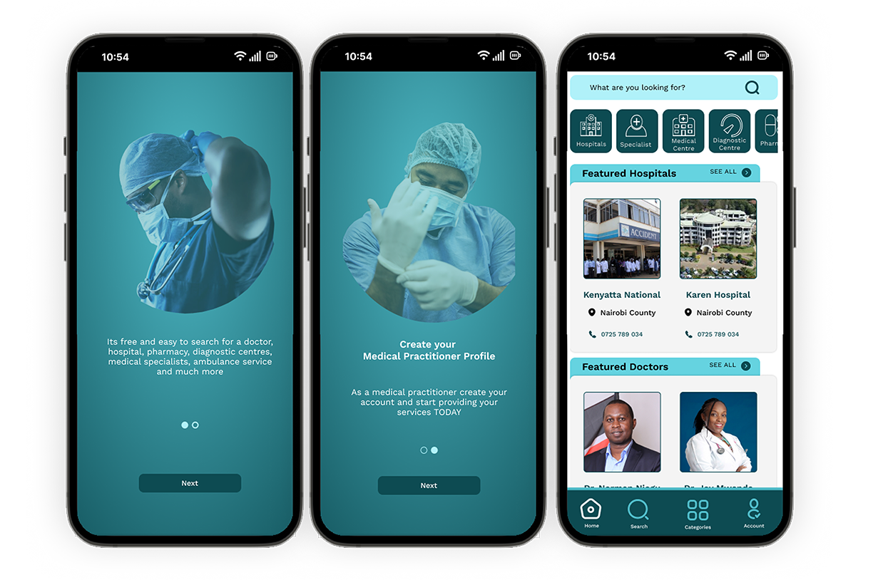
MedSelecta, a platform designed to streamline connections between medical institutions and healthcare practitioners, contracted us to design the user interface (UI) for their mobile application.
Client: MedSelecta International
Project Overview:
MedSelecta, a platform designed to streamline connections between medical institutions and healthcare practitioners, contracted us to design the user interface (UI) for their mobile application. The app serves as a portal where healthcare professionals can find opportunities in various medical institutions, while hospitals and clinics can recruit the talent they need. The goal of the project was to create an intuitive, clean, and professional UI that enhances the user experience for both practitioners and institutions, making it easy for them to navigate the platform and complete tasks efficiently.
Key Features:
- Clean, Professional UI: The design focused on simplicity and professionalism, ensuring that healthcare professionals and institutions can easily navigate the app’s features without unnecessary distractions. The interface is user-friendly, with clean layouts and clear typography to ensure readability and accessibility.
- User Dashboards: Created dedicated dashboards for both medical institutions and healthcare professionals. Each dashboard provides relevant information and actions, such as posting job opportunities, viewing applicant profiles, or managing applications.
- Job Listings and Applications: Designed a streamlined job listing and application interface where medical institutions can post job opportunities and practitioners can browse and apply to relevant listings. Filters and sorting options were incorporated to help users find the best match quickly.
- Profile Management: Practitioners can easily create and manage their profiles, including uploading certifications, specializations, and work experience. The UI allows users to update their profiles effortlessly, ensuring that their professional information remains up-to-date.
- Notifications & Alerts: Designed a notification system that keeps users updated on new job postings, application statuses, and any relevant messages from medical institutions.
- Responsive Design: Ensured the UI is responsive and optimized for a variety of devices, including smartphones and tablets, to provide a consistent experience across all platforms.
- Onboarding Flow: Implemented a smooth onboarding process for new users, guiding them through profile setup and app features to ensure a seamless introduction to the platform.
Challenges Addressed:
- Simplifying Complex Workflows: The app needed to cater to both medical professionals and institutions, each with distinct workflows. The UI design focused on creating an easy-to-use interface for both user types, making key actions—like posting jobs or applying for positions—intuitive and straightforward.
- Balancing Professionalism and Usability: Since MedSelecta is a professional platform, the design had to reflect trust and reliability while remaining easy to use. We balanced minimalism with functionality, ensuring the design was efficient but not overly complicated.
Design Principles:
- Minimalist and Functional: The UI design follows a minimalist approach, with a strong focus on functionality. The interface is clean, with well-organized sections, and uses neutral colors with a professional tone to convey trustworthiness.
- User-Centric Design: The user journey was at the forefront of the design process, ensuring that healthcare professionals and institutions could complete tasks with minimal friction. Actions like applying for jobs or managing postings were designed to be simple and intuitive.
- Brand Alignment: The design adheres to MedSelecta’s branding, ensuring a consistent and recognizable look and feel that aligns with the company’s professional image.
Tools Used:
- Design Software: Figma for creating wireframes, prototypes, and final high-fidelity UI designs.
- Collaboration: Worked closely with developers to ensure seamless implementation of the design, maintaining UI consistency across different screen sizes and devices.
This UI design project contributed to the success of the MedSelecta platform by offering a professional, user-friendly interface that facilitates smoother interactions between medical professionals and institutions.


